Benefit Loves
Loyalty App
Project Summary & My Role
-
Visual & Motion Design
-
UI & UX Design
-
Art Direction & Brand Guardian
Benefit Cosmetics approached us with a mission to transform their customers into devoted brand BFFs. We gladly took up the challenge and embarked on creating their inaugural loyalty app. Introducing Benefit Loves, an app which at the centre encompasses a digital loyalty card, a convenient treatment booking tool, and an enticing rewards hub.
To bring this vision to life I led the UI design, interaction design and prototyping for all app screens. In addition, I closely supported its UX development.
Creative Idea
Launched in 2023, the result was an elegant digital experience that seamlessly blends entertainment and user-friendliness. Notably, when users make purchases directly on the Benefit Cosmetics website or at one of the brand boutiques, they are rewarded with hearts—this includes bookings for treatments as well. These hearts can then be exchanged for exclusive offers, delightful treats, and exciting rewards.

Sitemap - Information Architecture
The sitemap demonstrated a high-level view of the app’s information architecture and was a key step in its initial development. It allowed us to investigate the app’s structure and the grouping of it features, based feature sets agreed with client. It provided an immediate overview of how each section of the app connected and flowed from one to another.

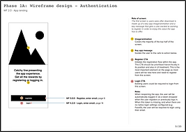
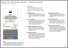
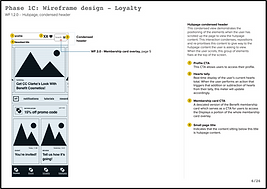
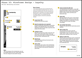
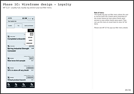
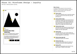
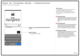
Wireframes
Creating wireframes allowed us to define the page-level information architecture and consider high-level interaction design. Acting as an initial visual representation of the intended design, the wireframes provided a blueprint for the future UI and development stages. While supporting the creation of these wireframes, I was also tasked with taking the existing Benefit website treatment booking tool user journey and adapting it for the Benefit Loves App - a key feature - I defined the UX & structure of each page before creating UI.
The wireframes detailed the user experience – they included labels & signposts to indicate the intended functionality of each component and corresponding elements. The wireframes were delivered in several sprints, each detailing specific sections/features of the app.


Design System
At the start of the UI phase, I begin creating a design system that proved crucial in shaping the app's UI and overall aesthetic. The UX process identified a vital list of components and elements necessary for the app's functionality.
The design system evolved continuously, as the UI was refined throughout the design phase. It also provided a comprehensive set of guidelines to steer future development and seamlessly integrate any new app features.

Defining UI
The philosophy I followed while defining the UI was to craft a meaningful and emotive experience that felt grounded, useful and elegant to use. I wanted to create a UI that was beautiful yet functional at heart - that celebrated the Benefit brand & identity and delivered on future scaleability, longevity and user loyalty.
Using the wireframes as a blueprint, I designed the UI from the ground up striving to establish a unified design approach. I wanted the UI to feel super intuitive – whereby after only a few initial interactions the user knew how to use the whole app. The minimal repeated use of certain rules and elements made this possible, installing an instant sense of familiarity – preventing the risk of any unwanted friction or blockers.
Additionally, the UI was created with the interaction design and development process both heavily considered throughout the whole process. Consulting closely with the development team, I wanted to ensure any proposed UI & Interaction design elements could be achieved.
The key to the UI lied in its simplicity – every element however small was important - with the intention that if calibrated correctly during the development phase, the result would be an engaging and emotive user experience.


Interaction Design & Prototyping
The interaction design and prototyping of key elements of the app was essential in detailing how the app interacted and responded to user inputs. To define these, I created a series of video demos and user flow prototypes. Not only was this an important part of the UI design phase, it was essential in helping to demonstrate functionality to key stakeholders - as well as providing a guide for the development process.
Content Modules
Defining how content was shown and delivered was an important part in design process and a key part of establishing the unified UI approach. Considering the different kinds of content modules that would be required was an essential part of this - These content modules were designed to be flexibly interchanged and applied, depending on the specific content page requirements.

Global Brand Update
In the early stages of the development phase, Benefit cosmetics underwent a global brand update. New brand guidance was provided, and the app needed to adapt accordingly.
Key design updates included: elevating look and feel to an older audience, simplifying and refining design elements further, reducing use of icons and refining the colour palette/use of typography.
The experience design, the information design and interaction design were protected. The updates were key from a brand perspective but still considered to ensure development and delivery of app could still be achieved in a timely manner.


Development & App Launch
I aided in providing guidance and feedback during the development phase. Helping to oversee primarily the development of the UI, as well as creating/providing further interaction demos where needed.
The app went live at the start of 2023 and is currently on the app store free to download.
Click to preview app
Results & Key Achievements
-
4.8 out of 5 stars rating on the App Store.
Roll the Credits
-
Agency – Movement Digital
-
Visual & Experience Director – Tim Ash
-
UX Lead – Fiona Hutchinson
-
UX Copywriter & Illustrator - Mike Stone
-
Development Agency – Mobikats
explore_more


